Styling form controls
A question that is frequently asked in forums like the css-discuss mailing list is how to style form controls in a consistent way across platforms. Most of the time, the question is asked by someone who has just tried to do that, and noticed the difference in rendering across browsers and operating systems.
The short answer is probably disappointing to many: you can’t. Some also argue that you shouldn’t, since doing so may reduce usability. My opinion on that is that light, sensible styling of some form controls can be OK, as long as you don’t overdo it. But what if we don’t think about usability, and just want to see what actually can be styled? I’ve made a few examples that make up a longer answer to the question about styling form controls.
There are a lot of form controls that can be used in an HTML form. For this exercise, I applied styling to the submit button (<input type="submit" />), the menu, a.k.a. the select box (<select>), the single line text input (<input type="text" />), the checkbox (<input type="checkbox" />), the radio button (<input type="radio" />), and the file select control (<input type="file" />).
I created three five six simple documents, each containing twelve controls of the same kind. Then I created a different CSS rule for each element. Due to the various controls having different properties to style, I made two three slightly different sets of rules.
The following rules were applied to submit buttons, select boxes, single line text inputs, and file select controls:
#el01 {color:#00f;}
#el02 {background-color:#ddd;}
#el03 {color:#fff; background-color:#33b;}
#el04 {border-width:4px;}
#el05 {border-color:#00f;}
#el06 {border:0;}
#el07 {font-family:"Courier New", Courier;}
#el08 {font-size:150%;}
#el09 {font-size:10%;}
#el10 {font-weight:bold;}
#el11 {padding:0;}
#el12 {margin:0; text-align:right;}
For the select boxes and submit buttons I changed the last rule a bit to make sure any effect of text-align is visible:
#el12 {margin:0; text-align:right; width:10em;}Checkboxes and radio buttons were styled with these rules:
#el01 {color:#00f;}
#el02 {background-color:#ddd;}
#el03 {color:#fff; background-color:#33b;}
#el04 {color:#fff; background-color:#33b;}
#el05 {border-width:4px;}
#el06 {border-color:#00f;}
#el07 {border:2px solid #999;}
#el08 {width:40px; height:40px;}
#el09 {font-size:150%;}
#el10 {font-size:10%;}
#el11 {padding:0;}
#el12 {margin:0;}
I kept the styling very basic in order to clearly show the effect each rule has on styling in the various browsers. There are of course many more styles that could be added, like width, height, background images, and different border styles, but I had to draw the line somewhere. When the rules were set up, I loaded the documents in the following browsers:
- Camino
- Firefox 1.0 PR Mac
- Firefox 1.0 PR Win
- IE 5 Mac
- IE 6 Win
- Opera 7.53 Mac
- Opera 7.53 Win
- Safari
All Mac browsers were running on Mac OS X 10.3.5, and all Windows browsers were tested in Windows 2000 and Windows XP. By default, this is what the various controls look like in each of the tested browsers:
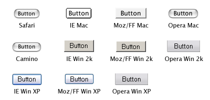
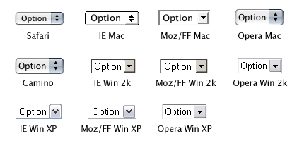
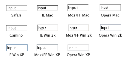
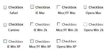
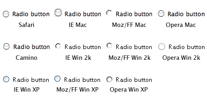
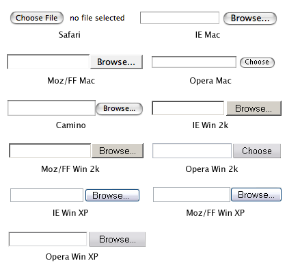
As you can tell, the default look of these form controls varies a lot between browsers and operating systems. And I haven’t even added any browsers running on Mac OS 9 or Linux to the mix.
The screenshots of the styled form controls are too large to include in this post, so they are available in separate documents:
- Styled submit buttons
- Styled select boxes
- Styled single line text inputs
- Styled checkboxes
- Styled radio buttons
- Styled file select controls
The documents also contain the CSS and XHTML used, so you can check what styling the browser you are using applies to these controls.
As the screen shots show, very little styling is applied the same way in every browser. Safari won’t apply anything but font size, and only within a narrow span. An interesting thing is how Opera changes the button shape when a background colour is applied. This is especially noticeable in the Mac version.
In conclusion: trying to style form controls to look the same across platforms is often a waste of time. Leave them to the browser/operating system defaults, or do only very light styling. That way you will save yourself a lot of frustration, and avoid making your site’s visitors think about form controls.
Phew. Hope I didn’t mix anything up.
Update: I’m working on an update to this article, in which the form controls that are missing from these examples will be included. Coming soon. Now available: Styling even more form controls.
Update: This article is more or less obsolete. Please refer to Styling form controls with CSS, revisited for a more up-to-date look at CSS applied to form controls.
- Previous post: Printing stylesheets
- Next post: Safari and XHTML